Optimise your website for conversion
If you’re looking for specific results and not just sharing information. Knowing how to optimise your website for conversion is critical.
A website optimised for conversion will guide your visitors toward your desired conversion point in a way that feels good to them.
The exact conversion metric will vary from business to business. For the sake of this article, we will focus on the two most common, completing checkout (buying a product) and, submitting a contact form.
Websites should feel like a well-presented exhibition, attractive, inviting and easy to navigate. You never want your customer to feel pushed in a certain direction, you want them to choose the path you’ve laid out for them.
This is achieved through understanding your;
1. website data,
2. utilising landing pages and,
3. ensuring website performance.
Let’s break it down, starting with:
WEBSITE DATA
Effective marketing activity is driven by setting goals and gathering data to track those goals.
In order to optimise your website for conversion, your website needs to be set-up to track the customer journey. Helping you identify blockages and areas for improvement.
Every social media, search engine, website builder, or eCommerce platform will include free analytics and user data. With countless apps and programs available to supplement or streamline this process.
Therefore, every business should understand and regularly review their website data to maintain a full picture of the customer journey. Doing so helps areas of concern stand out, allowing them to be addressed quickly.
For example, if you can see that the engagement rate for your website is at 30% and your average session time is under 30 seconds. It’s likely your website is;
1. Poor performing
Pages load slowly, with some elements not appearing or not reacting as expected e.g. dead links. See performance section below.
2. Unappealing
The website is unattractive, too wordy, hard to navigate or appears dodgy e.g. too many gimmicky features like pop-up banners or flashing ‘buy now’ buttons.
3. Misleading
If the wording or imagery used to attract customers to your website doesn’t match where they land. They may feel they have not received the information they were after. Or that they have been misled or scammed. For example, if I click on an Instagram ad for sunglasses but I get taken to an email signup page instead of a product page I may feel misled. All of these factors will negatively impact your ads and cause you to waste money.
Alternatively, if your website data is showing healthy traffic flow, high activity, and a decent bounce rate but few ‘add to cart’ events. Maybe you aren’t selling the product effectively. This can be addressed by using landing pages.
LANDING PAGES
Landing pages are one of the best methods for optimising your website for conversion.
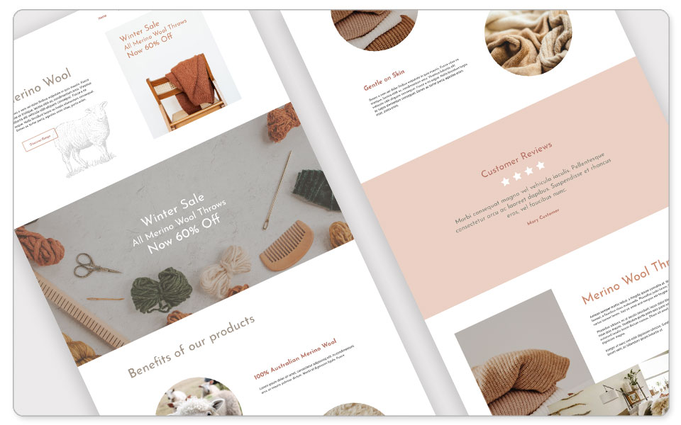
A landing page is a standalone page created for visitors to ‘land’ on when reaching your website. Acting like a brochure for your product or service. Providing added detail and closing with a strong call to action. Basically, a digital salesperson.
For example, ‘Belinda’ runs a homewares store, and she currently has a sale on Merino wool throw rugs. Her social media ads utilise beautiful, styled imagery of her products. Promoting the sale and touching briefly on the benefits of Marino wool.
Linking the ads directly to the throw rugs tab in her product catalogue, sounds reasonable and is certainly efficient. However, Belinda has multiple other products listed – some far cheaper than the Merino wool – what is encouraging visitors to focus on that particular product?
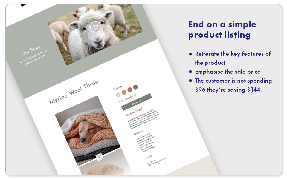
Instead, Belinda creates a dedicated landing page. Promoting the appeal and benefits of Marino wool, alongside appealing lifestyle and product shots. Topped off with a short video summarising all the points made, in an easy to consume manner. Before finally ending on a clean product listing that provides additional encouragement I the form of a discounted price. Potential savings and free shipping offer.
Throughout the page subtle language and sales cues have been utilised to encourage the purchase decision, such as:
• Short paragraphs and multiple images, making the page easy to read.
• Active, encouraging language.
• Medium sized banners or page breaks, encouraging the customer to keep scrolling and discover more.
• Video is brought in further down the page, roughly at the point viewers might be getting bored of reading.
• A simple product listing that reiterates the key features of the product and emphasises the sale price. You’re not spending $96 you’re saving $144.
Interested customers now feel they’re getting a good deal on what they have learnt is a high-quality, desirable product.
Any potential barriers to making the purchase are removed. No comparable product listings, and no need to click away to find out more about the range. This single page gives them everything they need and flows right into checkout.
The customer happily walked through the exhibition and found themselves in the gift shop.
Not only do landing pages help streamline the sales process. They also greatly improve your website’s SEO, data capture, and remarketing potential. You now have a whole page dedicated to a product keyword. And, everyone who views the page or completes a checkout can be added to a re-marketing list for future campaigns. Win, win!
PERFORMANCE
We’ve already established that making the path to purchase as smooth as possible is critical for e-commerce. Therefore, performance is critical when optimising your website for conversion, to avoid any stumbles.
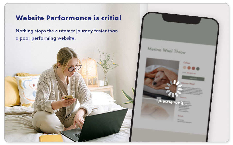
Nothing stops the customer journey faster than a poor-performing website.
Some things that will instantly lose all but the most determined customer are:
• Long loading times.
• Broken Links.
• Hard to read text or ugly graphics.
• Missing Images.
• Videos that don’t play.
• Lengthy or glitchy checkouts.
All these concerns can be fixed at any time, but prevention is better than cure. Being aware of these potential stumbling blocks and how to prevent them when you build your website will reward you greatly in the future. Little things like managing your images sizes to reduce loading speeds. Or having your team test links before a page goes live, are easy to do and will save you time in the future.
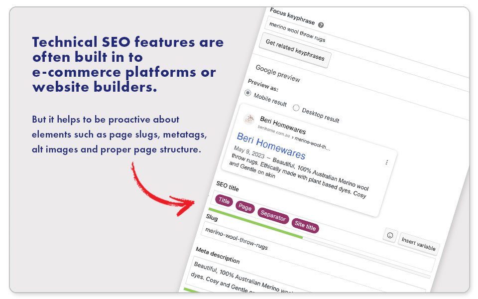
You’ll also want to ensure your page is properly set up for technical SEO. Making your landing pages as efficient to crawl as possible. This is generally straightforward when using a website or eCommerce platform as these features are built in. But it helps to be proactive about elements such as page slugs, metatags, alt images, and proper page structure.
If you’re working with a developer on a custom website build, be sure to have a detailed discussion about SEO. Making sure they understand your expectations and can meet your needs.
Optimise your website for conversion
A website is a must-have for any business. By knowing how to optimise your website for conversion you can increase the effectiveness of digital marketing campaigns. Get better results from your ads, gather richer data, and set yourself up for improved search rankings.
If you’re looking to create a new website or want to see how your current website can be improved upon, get in touch. We’ll be happy to help.
References
https://www.hotjar.com/blog/website-conversion/#
https://support.google.com/analytics/answer/1009409?hl=en
https://www.semrush.com/blog/bounce-rate/
https://unbounce.com/landing-page-articles/what-is-a-landing-page/
https://ppcexpo.com/blog/destination-mismatch-google-ads

